Five Charts You’ve Never Used but Should
By Jonathan Schwabish

“An excellent primer for anyone who wants to display quantitative information clearly and powerfully.”
—Robert B. Reich, Chancellor’s Professor of Public Policy, University of California at Berkeley, and former U.S. secretary of labor
• • • • • •
Now more than ever, content must be visual if it is to travel far. Readers everywhere are overwhelmed with a flow of data, news, and text. Visuals can cut through that noise and make it easier for readers to recognize and recall information. Yet many of us were never taught how to present our work visually.
We are not born knowing instinctively how to read a bar chart or line chart or pie chart. Most of us learn those basic chart types in grade school. But there is a vast array of graphic types available that can effectively communicate your work to your audience.
In my new book, Better Data Visualizations: A Guide for Scholars, Researchers, and Wonks, I survey more than eighty visualization types, everything from histograms to horizon charts, ridgeline plots to choropleth maps, and explain how each has its place in the visual toolkit.
To get you started, here are five graphs that perhaps you’ve never used before but that you should consider. They either do a better job showing certain types of data or they are more engaging and interesting than basic chart types.
Instead of a Paired Bar Chart, Try a Dot Plot
The dot plot (sometimes called a dumbbell chart, barbell chart, or gap chart) is one of my favorite alternatives to a paired or stacked bar chart. It uses a symbol—often but not always a circle—corresponding to the data value, connected by a line or arrow. The data values correspond to one axis and the groups to the other, which do not necessarily need to be ordered in a specific way, though sorting can help.
When bar charts include too many bars, the graph looks cluttered. By contrast, the dot plot shows the same data with a dot at each data value connected by a line to show the range or difference. The circles use less ink than the bars, which lightens the visual with more empty space. The country labels can be placed close to dots or set off to the left along the vertical axis. If necessary, data values can be placed next to, above, or within each circle.
Instead of a Bar Chart, Try a Slope Chart
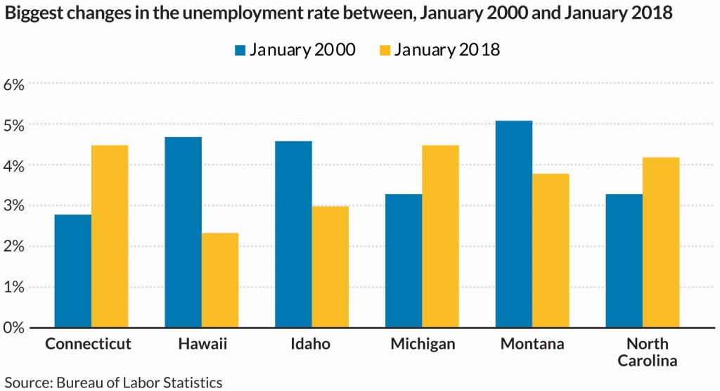
Bar charts can also show changes over time. If, for example, you had data for two years for several countries, you might use the paired bar chart, which is a standard way to visualize two data points for multiple groups.
With this kind of visualization, we ask our reader to process the level and change in the variable among and across the six groups. There is a lot of ink in the graph, and it asks the reader to do lots of mental math. We could, of course, just plot the change between the two time periods, but we often want to show both the level and the change.
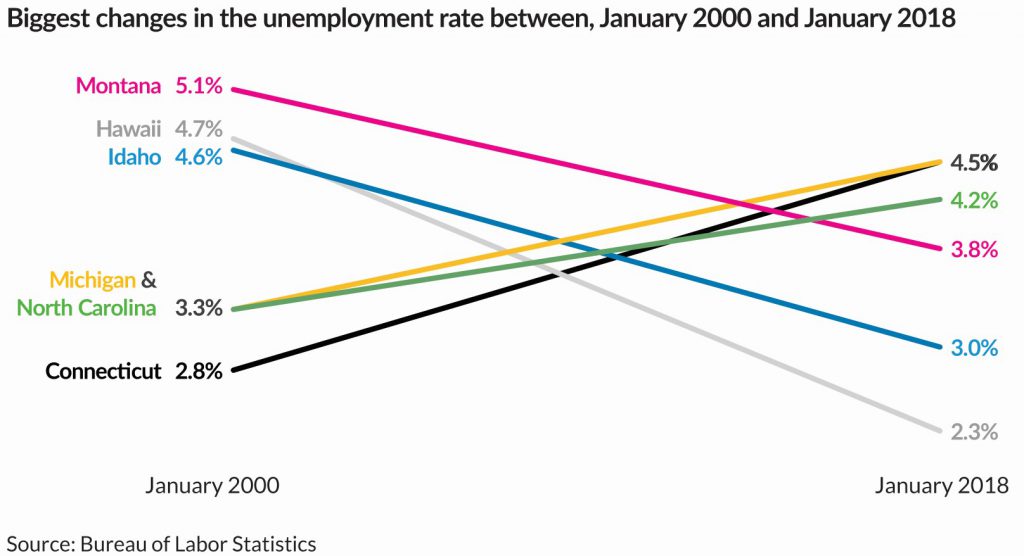
The slope chart addresses this challenge by plotting each data point on a separate vertical axis and connecting the two with a line. We can easily see the relative values of each data point. Here, for example, we can see—perhaps even more easily than in the paired bar chart—that Montana had the highest unemployment rate in the first month and Connecticut had the lowest.
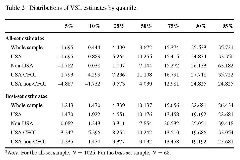
Instead of a Cluttered Table, Try a Heatmap
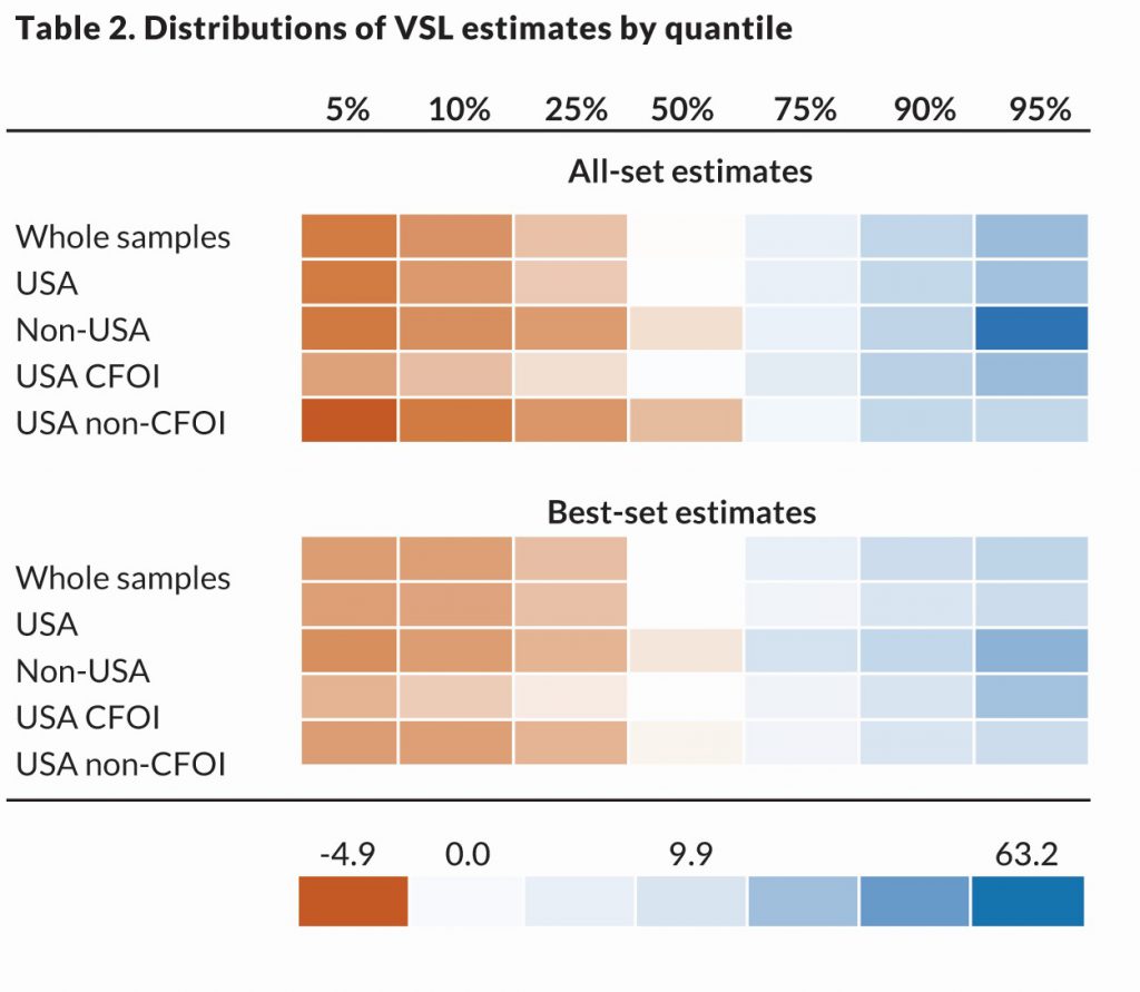
Heatmaps use colors and saturation to represent data values. Simply put, a heatmap is a table with color-coded cells. They are often used to visualize high-frequency data or to show general patterns rather than exact values. Generally, darker shades correspond to higher values and lighter shades to lower values.
Instead of Two Line Charts, Try a Connected Scatterplot
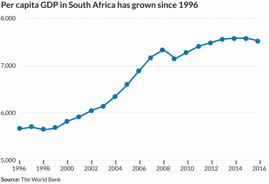
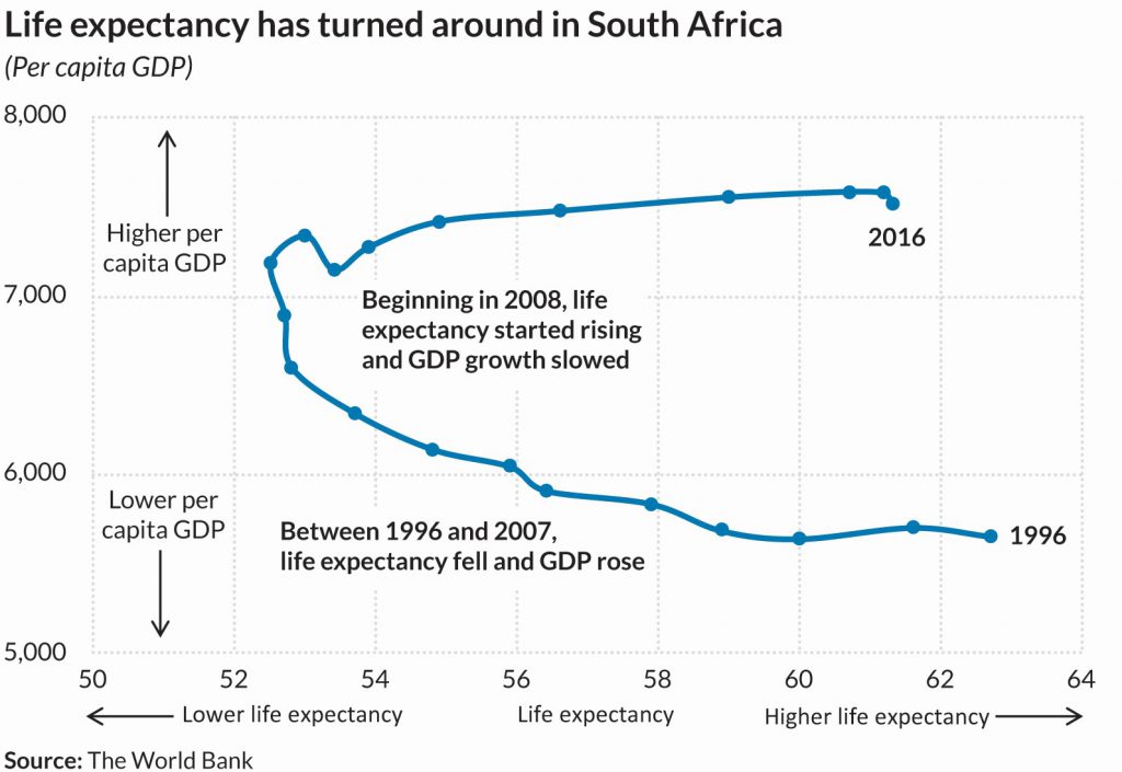
Imagine showing two line charts side-by-side. You may be asking your reader to examine the relationship between the two. Do they move together? Do they diverge or converge? How are they related?
One way to bring two time series together without using a dual-axis chart is the connected scatterplot. A connected scatterplot shows two time series simultaneously—one each along horizontal and vertical axes—and connects them with a line to show relationships of the points over time.
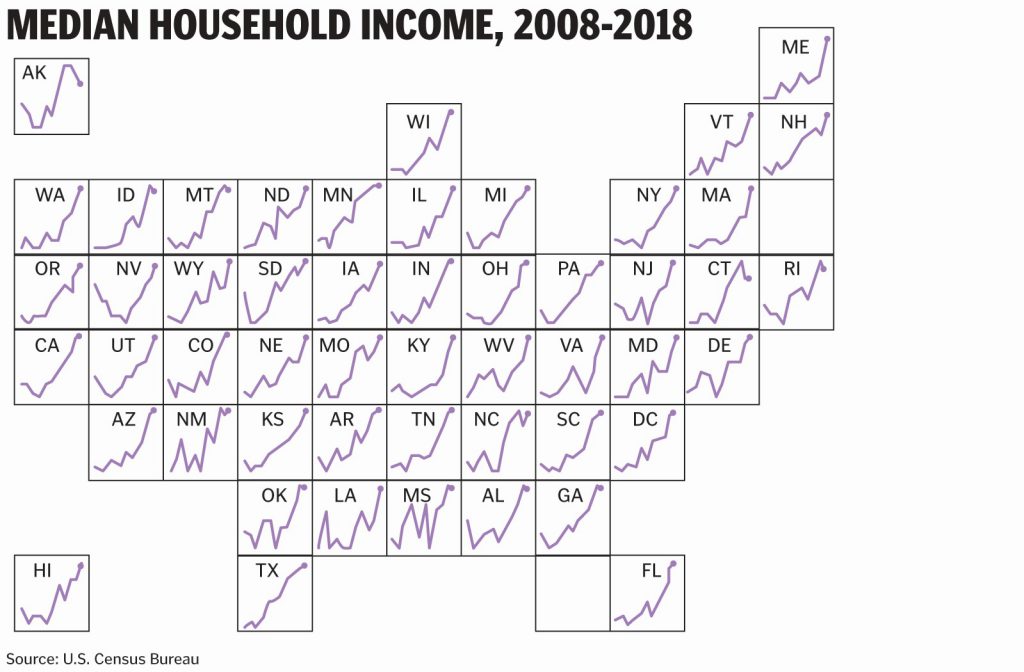
Instead of a Chloropleth Map, Try a Tile Grid Map
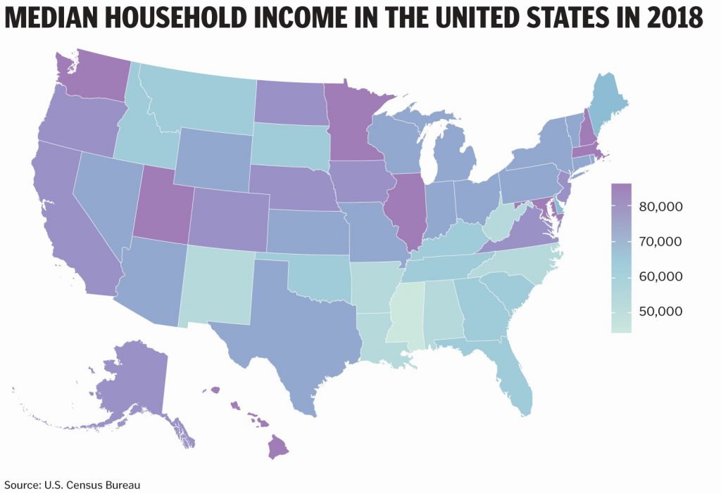
One way to visualize geographic data is to color areas on your map based on their data values. These kinds of maps are called choropleth maps and are familiar to readers (especially now right after the presidential election). Maps like these introduce a geographic distortion, however; the size of the geographic area may not correspond to the importance of the data value. Even with this distortion, however, maps are an easy and familiar way to present geographic data to your readers.
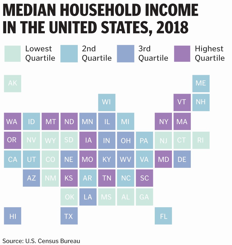
One alternative to the standard choropleth map is to create what is called a tile grid map, in which each geographic unit is represented as a single square. The advantage of the tile grid map is that each state is the same size, which abstracts from the geographic distortion. The disadvantage is that the geographic units are now not necessarily in the right place. Here, for example, South Carolina is located east of North Carolina, California doesn’t touch Arizona, and Wisconsin is north of Minnesota, all of which are not their real geographic relative locations. The arrangement of the tiles can be changed of course, but any decision is going to be arbitrary because we have moved away from true geography.
Save 20 percent on our conference titles on display when you use coupon code AEA at checkout from our website by March 1, 2021.


